In the last two posts, I printed a photo on fabric and embroidered over it, then I printed a watercolor on fabric and embroidered over it. Today I wanted try try going freehand using a very minimal outline and a photo reference. I had so much fun and the result was a much looser and more abstract embroidered painting.

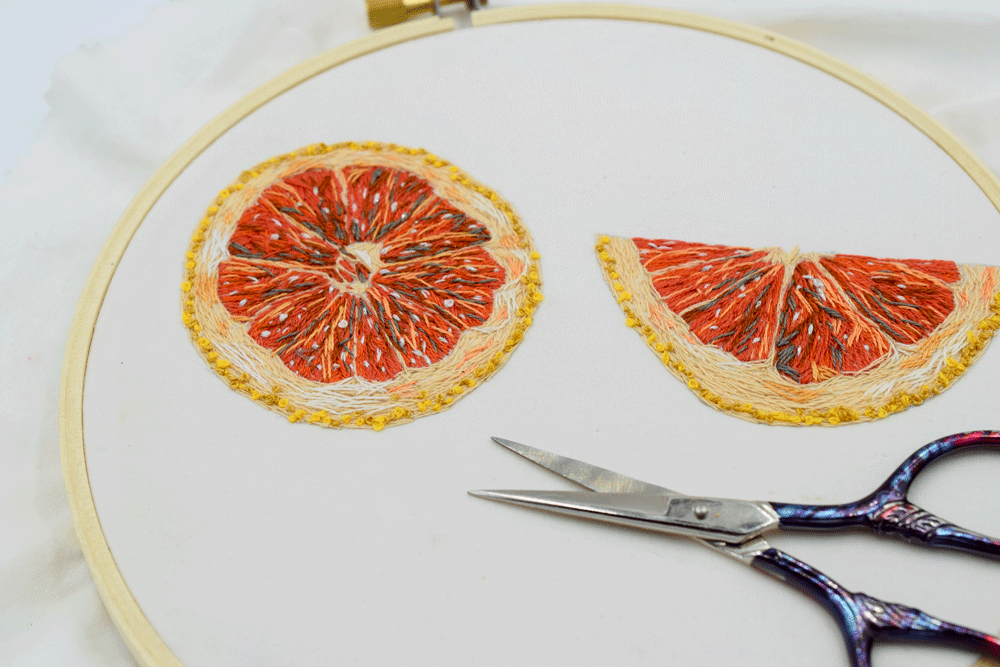
I started by choosing my reference photo of a ruby red grapefruit. I cut a piece of white cotton fabric to fit into a six inch hoop and another piece of fabric the same size to layer under the first piece. It acts as a stabilizer and to make the fabric less transparent. I fitted both pieces of fabric in between the two pieces of the wooden embroidery hoop and then pulled the edges to make the fabric nice and tight. I tightened the screw at the top and pulled the fabric tight again.
I grabbed my mechanical pencil and made a sketch of the grapefruit pieces in my reference photo.
I went to my thread stash and began putting together my color palette. I used one thread of the six stranded fabric for the whole piece. It takes a lot longer but I love the finer detail it creates. I started off with a coral color.


I sewed until I ran out of the color of thread I was using, then jumped to another color. I kept my reference photo right above the embroidery where I could see it easily and often.

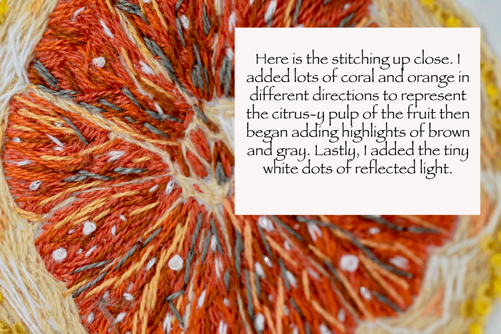
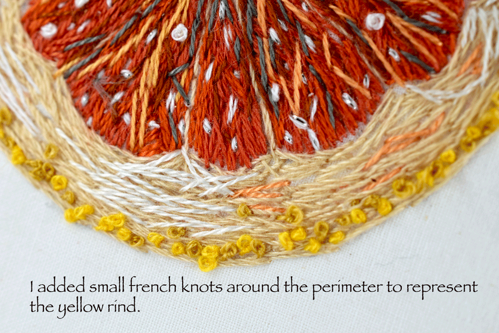
I used mostly straight stitches that followed the shape in which I was sewing. See how the rind is just a whole bunch of random straight stitches that sort of follow the arched shape? I continued to add little highlights and color variations as I saw them in the photo.
Before you know it, I end up in a trance and finish with out taking anymore reference photos! Sorry about that.


Could double for a pizza if you didn’t know any better.
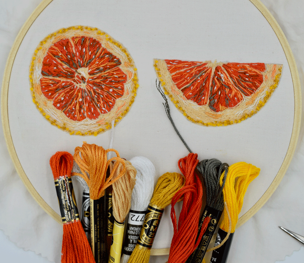
I am always delightfully surprised to gather together the color palette I ended up using.

Here is the embroidery next to the photo. It looks totally different from a little further away doesn’t it? I love the abstraction that the freehand stitching created. It adds whimsy and movement.

Not sure how I am going to display this. I may frame it and group it with the apple and strawberry as kitchen decor. What is it with me and fruit?

They make more sense all together, don’t you think?
I actually think the realism of the other fruits makes the grapefruit look more realistic or is it the other way around? The grapefruit makes the other fruit look more whimsical? Oh well, either way I think they compliment each other somehow.
Thanks for following the journey along if you made it this far! Explore fearlessly, you have nothing to lose!!!
Warmly,
Pam