Are you familiar with the term negative space as it applies to art? A loose definition would be that negative space is the area around the subject of focus. What I will show you today is an example of how to use your negative space (the space around the subject) to create visual interest.
If you want to follow along get some scrap fabric and a wood embroidery hoop. I grabbed some gray linen but any cotton fabric is great for practice. I used a small 4 inch embroidery hoop. I will be making a monogram so 3-4 inches is a nice size for this project.
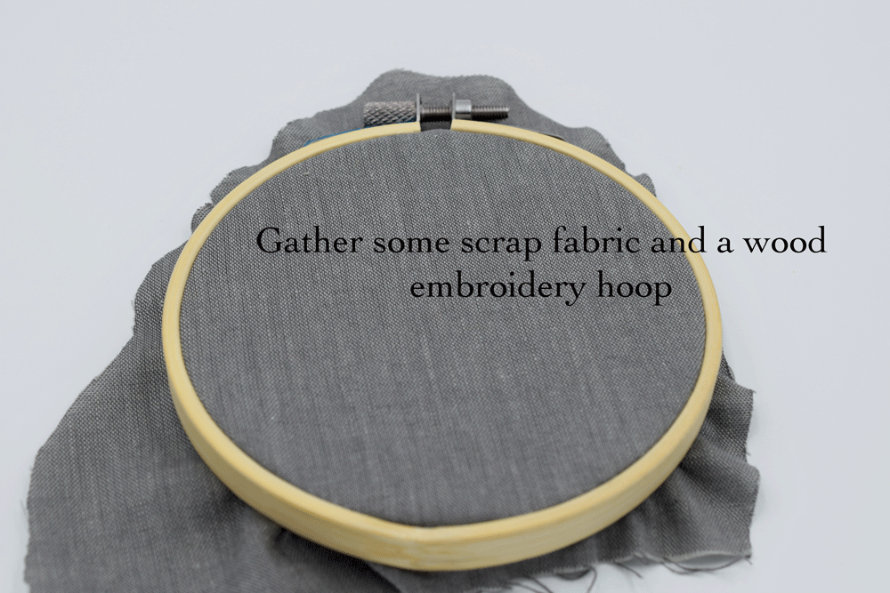
Place your fabric in the hoop and tighten it by tugging on the fabric around the circle then tightening the screw at the top of the hoop.
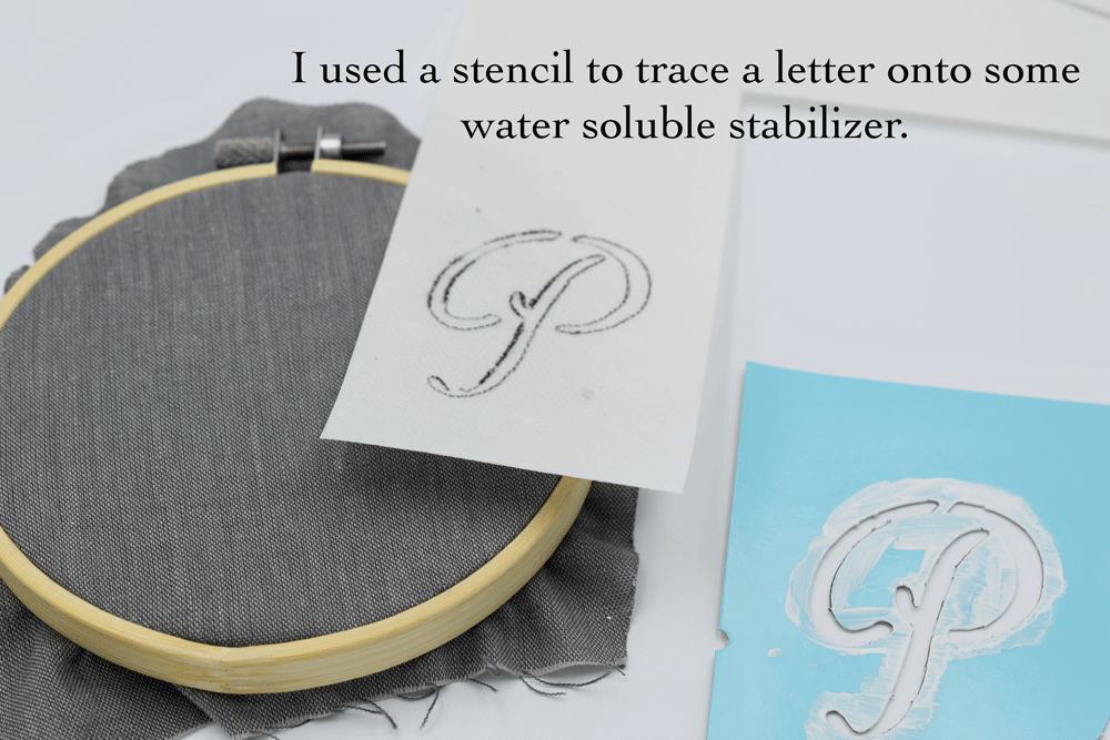
Next, using a stencil, I traced a letter onto water soluble stabilizer. You can find letter stencils at your local craft store. The ones I used were Martha Stewart alphabet stencils pictured below. I love these since they have an elegant simplicity.

If you are not familiar with water soluble stabilizer it is a sticky backed material that you can trace your design onto, peel off the paper backing, then stick onto your hoop and stitch. Once you are done stitching, you rinse off the stabilizer with warm water. This is the kind I used:

Another great thing about this stabilizer is that you can print designs from your home computer. I find it so much easier than tracing. The only time I don’t use this stabilizer is if I do not want to have to wet my fabric at the end. Sometimes threads can bleed, particularly if you are working with dark threads on a really light surface or a dry clean only surface.

Once you have traced your design, peel off the paper backing, center your design, and stick to the fabric.
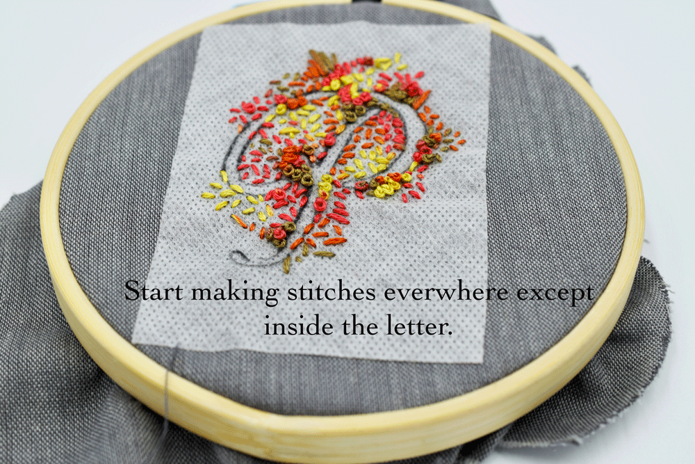
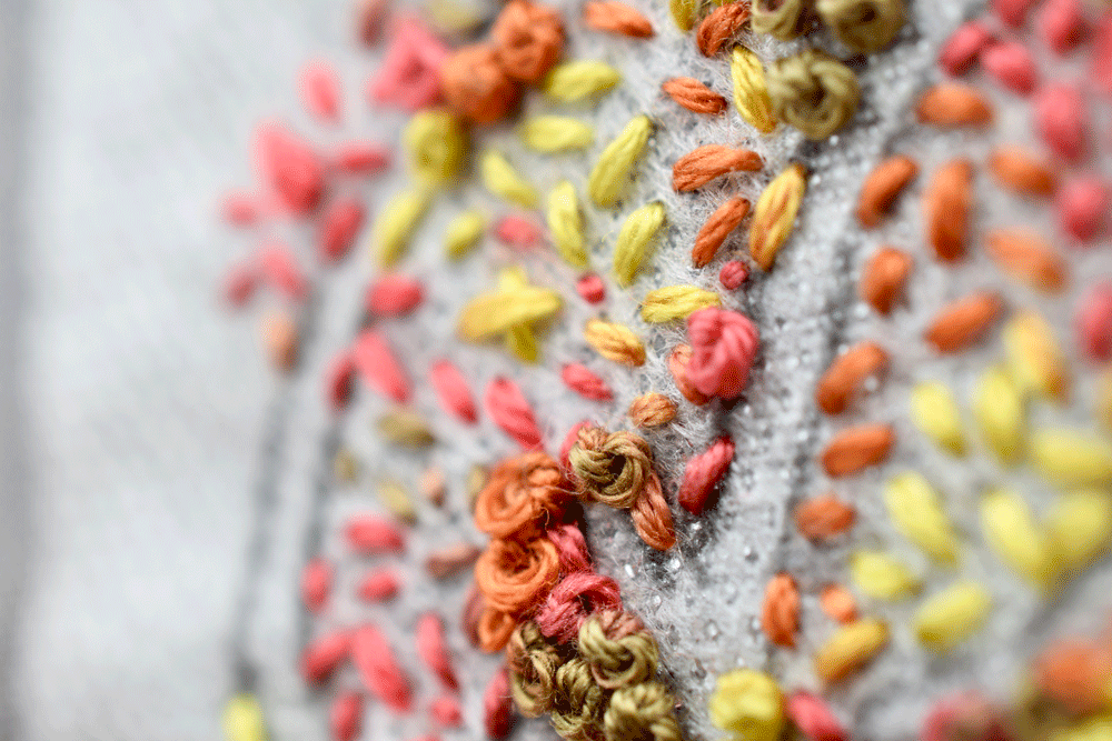
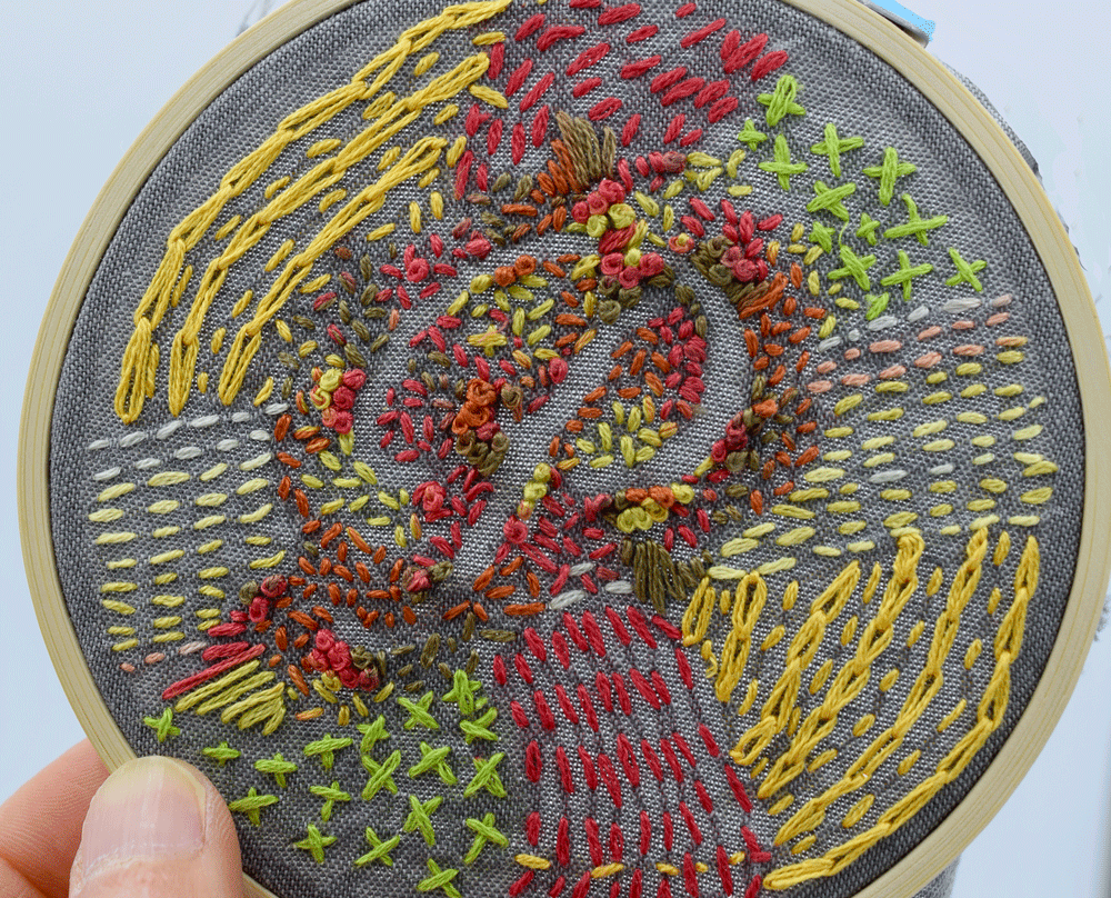
Now the fun part! Start filling in the negative space (the area around the letter) with stitches. I used a variegated thread and some basic stitches such as FRENCH KNOTS, SEED STITCH, and STRAIGHT STITCH. Try to strictly adhere to the lines of the letter. I had some french knots right on the line and I found later that they effected the shape of the end product.
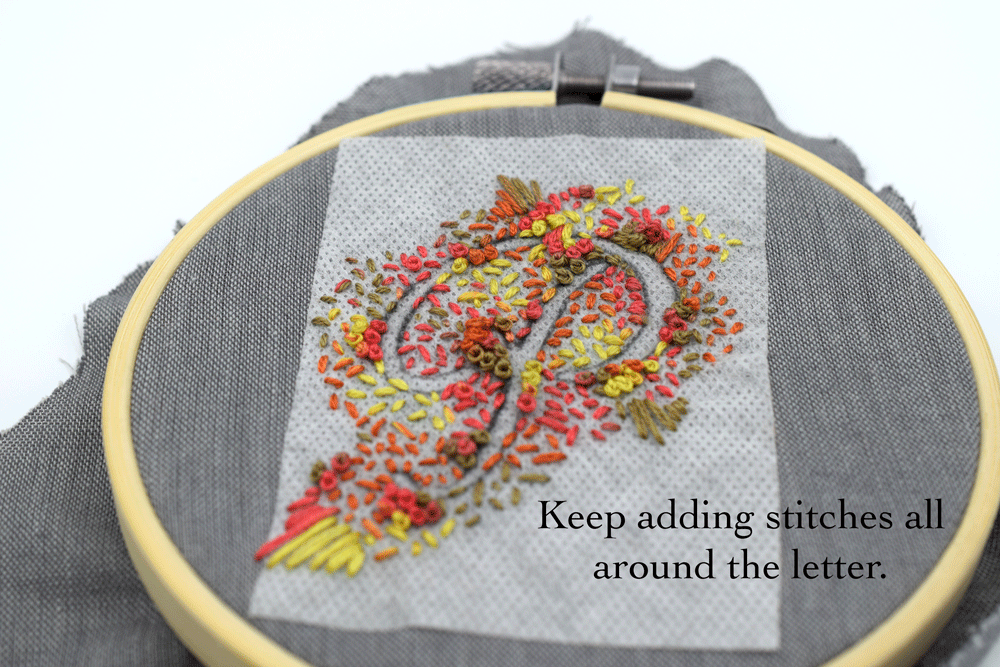
Keep adding stitches until it looks balanced all around. You can stop when the whole outline of the letter is filled in and looks balanced all around but in my classic over-doing it style, I decided to fill in all the negative space.

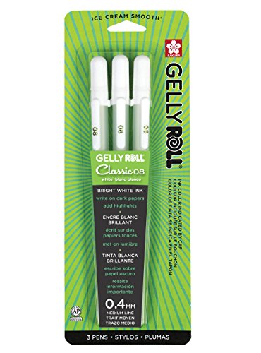
I marked off a segregated area where I wanted to stitch next. When working on a darker surface fabric, I find white gel pens to be very handy. They wash right off with water or a damp cloth. Here are the ones I used:
I love these pens so much and always keep a handful at my desk. I use them often to add white highlights to my watercolor paintings and they look so cool on black paper.

I added a simple RUNNING STITCH using variegated thread then marked off another area to stitch.
If you are unfamiliar with the variegated thread I keep referring to it is a skein of thread that has multiple colors dyed into it so your thread changes colors as you are stitching. I am just in love with it. Here is an example below:

I have the above pack but the one I used I found individually at the craft store. The variegated are a little more expensive than the solid colors probably due to the additional labor to make them but they are still relatively inexpensive and I just love the effects they create.
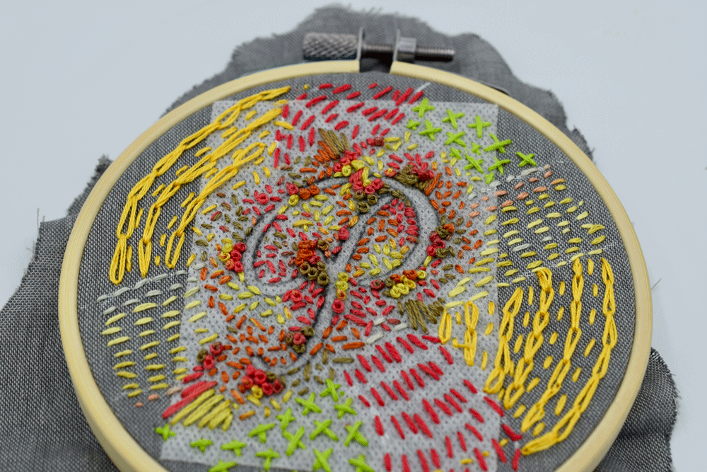
I filled in the marked area with a solid color in running stitch and then filled the remaining spaces with CHAIN STITCH and cross stitch.
After I finished stitching, I removed the fabric from the hoop and ran it under warm water to remove the stabilizer. Then I popped it in the dryer with a load of laundry.
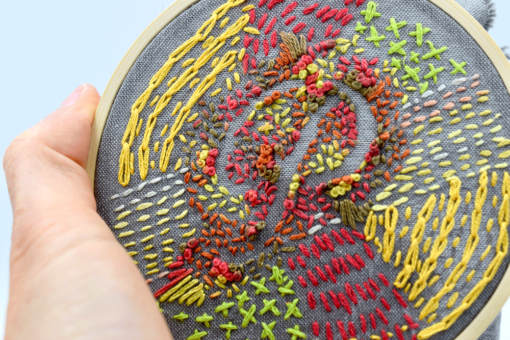
Here it is with the stabilizer washed off. I had play with the stitches a little to clarify the border of the letter. I think when I try this again, I will make the stitches around the letter even smaller to make the letter more defined.


I wanted to see if I could get a more dramatic effect by using darker background fabric and smaller stitches. I used white gel pen to stencil my letters then I used BACKSTITCH and SATIN STITCH for around the “f”. I used variegated thread and SEED STITCH around the “r” and SATIN STITCH around the “e”. I threw in some french knots for some different texture. I think my favorite is the effect the satin stitch creates.

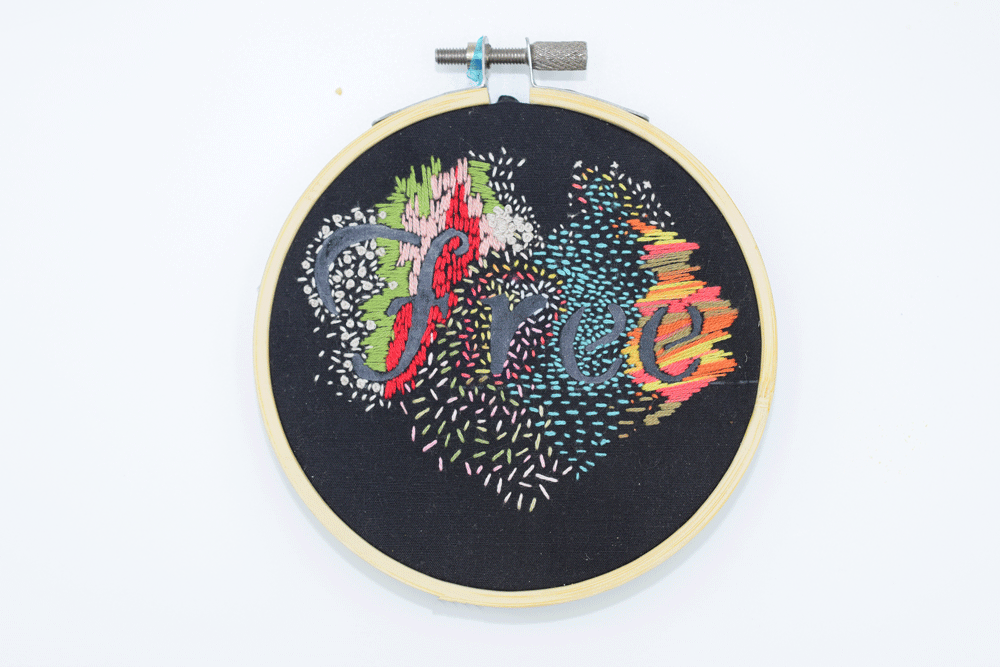
I think this would be a cool little Monogram project to try. It would make a nice holiday gift, like an ornament or present topper. I think I will try the next one using all satin stitch (As I did around the around the “e”. It really pops.) Hope you are feeling inspired to try one out yourself.
*This post may contain affiliate links
Thanks for stopping by and Happy Fall!
Warmly,
Pam